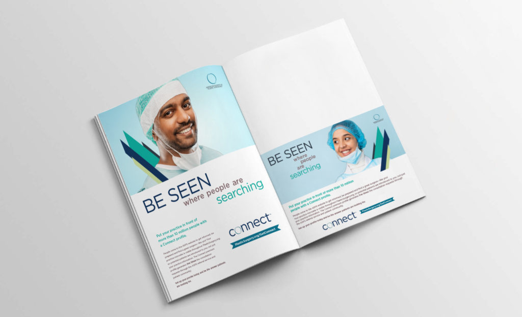
During my time at ASPS, Plastic Surgery Connect, a service to get surgeons in touch with potential clients, went through two rebrands. The first was a simple shift over from the original name “Match” as it was too similar to other well-known names. The logo was kept but the look and feel was re-designed.
A second rebrand occurred shortly after as ASPS wanted a more modern logo, possibly one with just text that somehow incorporated the ASPS Symbol of Excellence.
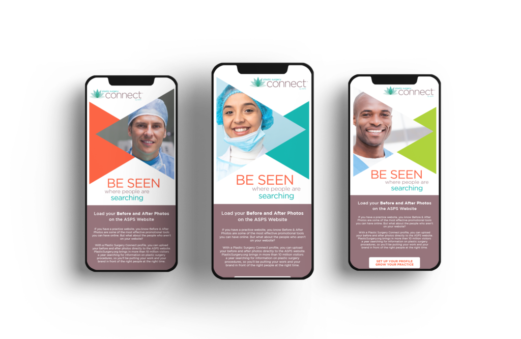
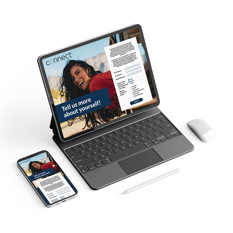
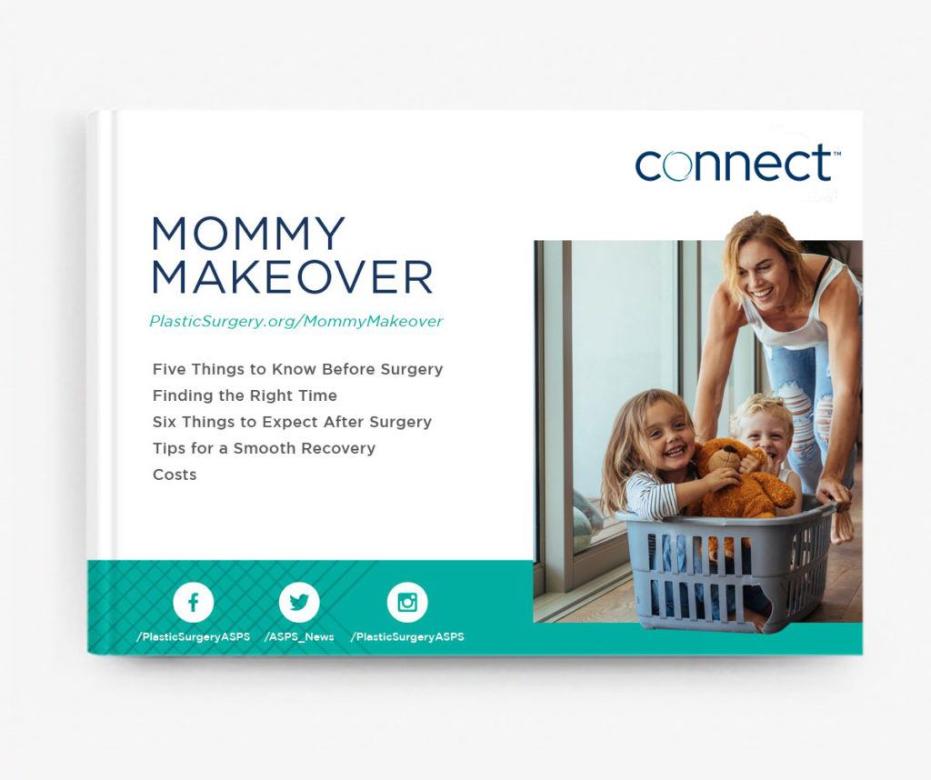
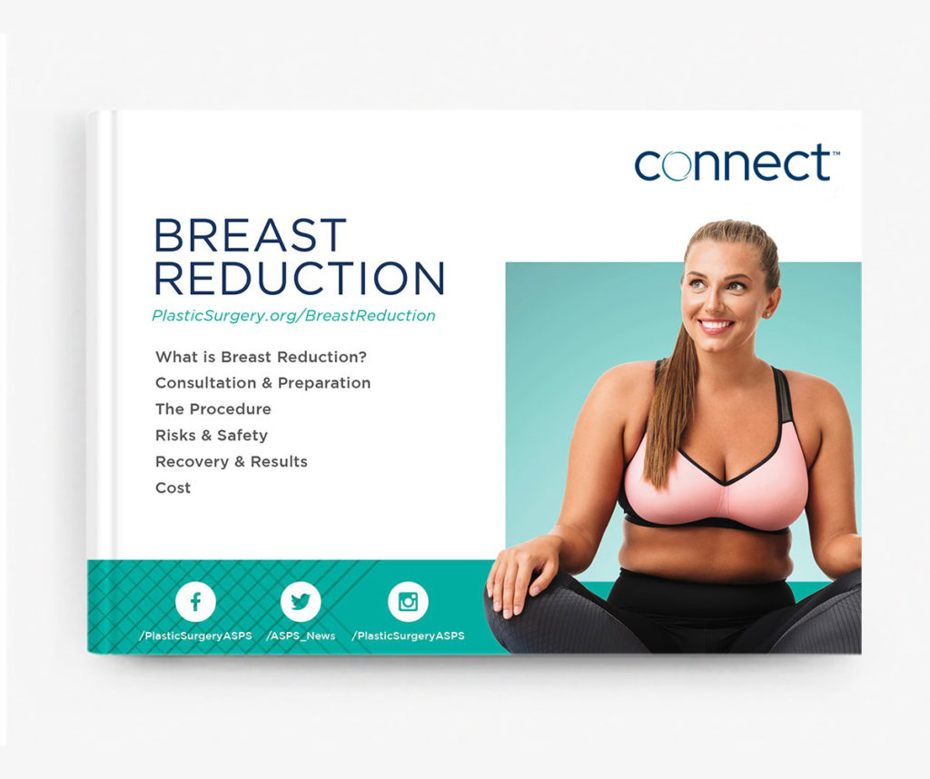
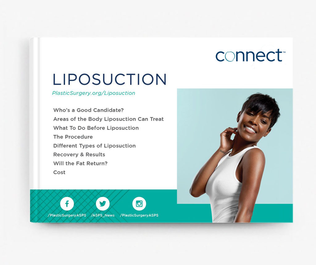
The deliverables:
My thought process:
After the first rebrand, I knew it would be jarring to shift everything over to a completely new look. So, I incorporated pieces of the old look and the new and we came up with something more modern, with an updated color palette.
To see an example draft of an email campaign prototype, please click here.
